Why should Mobile-First Design be your priority in 2020?
According to studies, around 94% of people judge websites based on responsive web design. Learn why a mobile-first design should be your number one priority in the next following years.
What is a Mobile-First Design?
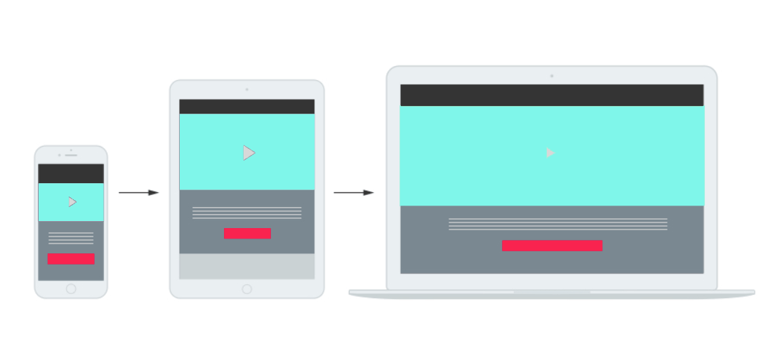
The mobile-first design stands for designing for the smallest screen and working your way up. Most importantly, if your Website performs well on mobile devices, it will perform even better on any other too.
Mobile-first design is the content-first design. It forces you to use your space smartly and find just the right spot for every element. Not everything will fit into a phone view, so you have to set priorities based on what will achieve the site’s goal. Forget about meaningless neverending texts. If you want good results by default, you will be left having only the most valuable content.
So you should think smart, and make a plan, or ask for professional help.
What is the difference between Mobile-First and Mobile Responsive design?
There are two ideologies in the web design world. One is called progressive enhancement (mobile-first), and the other is its graceful degradation (desktop first). Progressive enhancement ideology means that websites should first be designed for smaller devices, and developers should adjust it to a bigger screen. The other says the opposite. You should at first design your site for desktop use, and then adjust it for smaller screens.
The progressive enhancement ideology is becoming more popular as mobile users are getting more and more traffic to websites. The problem with graceful degradation is that when you build the all-inclusive design right from the beginning, the elements merge and become harder to accentuate and separate.
What strategy should you use?
In the last 6 years, the number of mobile phone users worldwide has gone up to nearly one billion, from 4.1 billion to 4.93. Not long after, Google announced that Mobile-First Sites would rank higher.
Besides the trends, this should be an easy decision for you.
Ask yourself a question: What is your target audience using? Are they PC lovers? Or are they preferably using their smartphones when they are on your Website? Some B2B companies still have tons of clients using PCs.
If you are not sure how to see that, start by using Google Analytics. It is to get to know your audience better. You will be able to see what devices they are using, their gender, where they are from, how much time they are spending on your site, etc.
Mobile-first strategy benefits
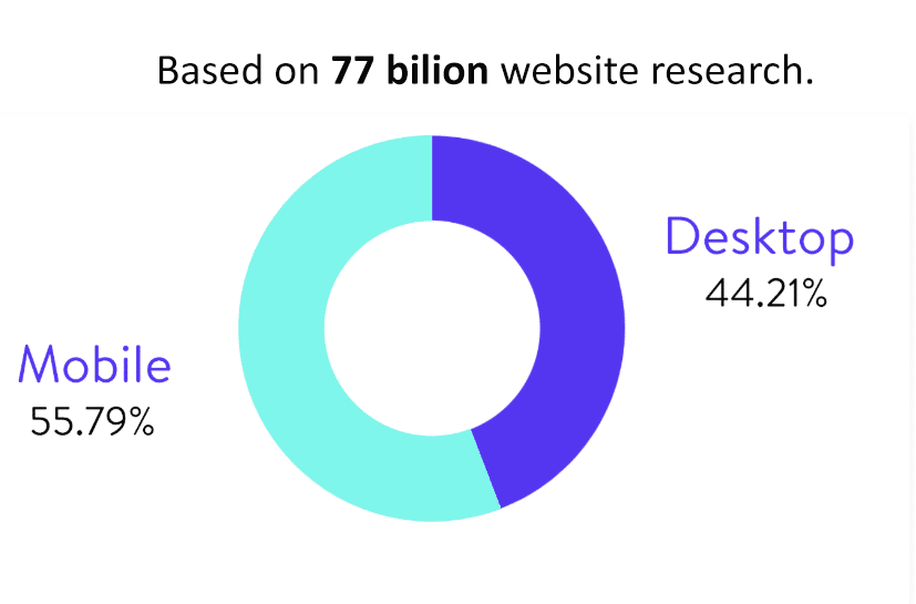
55.79% of the internet traffic is done via mobile phones, and experts predict an increase up to 75%, which is not to underestimate.
First impressions are hard to change, and clients tend to judge a company if it has a bad website.
Here are benefits you could have if you adjust your Website with a mobile-first approach.
- Best user-experience on mobile devices
- Google uses mobile-first index
- Faster websites
- Design website to use built-in phone features
- Investing in future